组件主题
内置CSS变量
如果想要修改组件的主题,可以通过修改CSS变量来实现。以下是内置的CSS变量:
css
:root{
  --widget-color: #fff;                                         /*组件文字颜色*/
  --widget-primary-color: rgb(0, 149, 255);                     /*组件主色调*/
  --widget-divider-color: rgba(255,255,255,0.4);                /*组件分割线颜色*/
  --widget-border-radius: 22px;                                 /*组件圆角*/
  --widget-border-color: rgba(255,255,255,0.4);                 /*组件边框颜色*/
  --widget-background-color: rgba(0,0,0,0.5);                   /*组件背景颜色*/
  --widget-background-border-color: hsla(0,0%,100%,.06);        /*组件背景边框颜色*/
  --widget-background-box-shadow-color: hsla(0, 0%, 100%, 0.1); /*组件背景阴影颜色*/
  --widget-font-size: '14px';                                   /*组件字体大小*/
  --widget-font-family: 'inherit';                              /*组件字体*/
  --widget-padding: 12px;                                       /*组件内边距*/
  /*以下变量不建议修改*/
  --widget-outer-padding: 12px;                                         /*组件外边距*/
  --widget-outer-shadow-color: rgba(0, 0, 0, 0.2);                      /*组件外阴影颜色*/
  --widget-inner-width: calc(100vw - var(--widget-outer-padding) * 2);  /*组件宽度*/
  --widget-inner-height: calc(100vh - var(--widget-outer-padding) * 2); /*组件高度*/
}
组件尺寸
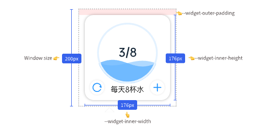
组件的实际显示尺寸不等于窗口尺寸。通常会预留下12px的边距(--widget-outer-padding),用于显示阴影,那么组件实际的大小为:
--widget-inner-width = 100vw - var(--widget-outer-padding) * 2--widget-inner-height = 100vh - var(--widget-outer-padding) * 2
图例中的窗口大小为200px,那么组件的实际大小为200px - 12px * 2 = 176px。
组件背景
通常情况下,使用<widget-wrapper></widget-wrapper>包裹组件内容,这样可以自动应用组件的背景颜色、背景边框、背景圆角、背景阴影等样式。
vue
<template>
  <widget-wrapper> //👈会帮你自动应用组件的背景样式
    <div>组件内容</div>
  </widget-wrapper>
</template>