Widget
A widget can be a clock, weather, calendar, etc., which can be understood as an HTML page, but displayed on the desktop in the form of a widget.
xx.widget.ts
Each widget must have a .widget.ts description file to define its basic information, such as title, description, author, version, routing information, etc.
├── public
├── src
│   ├── App.vue
│   ├── assets
│   ├── main.ts
│   ├── router
│   ├── widgets
│   │   ├── clock
│   │   │   ├── Clock.widget.ts       # 👈 Widget information
│   │   │   ├── ClockConfigView.vue
│   │   │   ├── ClockWidgetRoutes.ts
│   │   │   ├── ClockWidgetView.vue
│   │   │   ├── model
│   │   │   │   └── ClockModel.ts
│   │   └── widget-router.ts
├── .vscode
├── env.d.ts
├── index.html
├── package.json
├── README.md
├── tsconfig.app.json
├── tsconfig.json
├── vite.config.ts
├── widget.package.ts
└── ...
Example
import { Widget, WidgetKeyword } from '@widget-js/core'

const ClockWidget = new Widget({
  path: '/widget/clock',                        // Widget path
  configPagePath: '/widget/config/clock',       // Widget configuration page path
  name: '.clock',                               // Widget name
  title: { 'zh-CN': 'Clock', 'en-US': 'Clock' }, // Widget title
  description: { 'zh-CN': 'Animated Clock', 'en-US': 'Clock with animation' }, // Widget description
  categories: ['time'],                         // Widget search categories
  lang: 'zh-CN',                                // Widget default language
  width: 2,                                     // Default grid width
  height: 2,                                    // Default grid height
  minWidth: 2,                                  // Minimum grid width
  maxWidth: 4,                                  // Maximum grid width
  minHeight: 2,                                 // Minimum grid height
  maxHeight: 4,                                 // Maximum grid height
  previewImage: '/images/preview_clock.png',    // Preview image
  socialLinks: [
    { name: 'github', link: 'https://github.com/rtugeek/stocks-desktop' },
  ],
})
export default ClockWidget
Widget Name
TIP
The widget name is its unique identifier, consisting of the widget package name and the widget name.
In the example above, .clock is the short name, but the actual widget name would be widgetjs.cn.widgets.clock.
Widget Types
There are 3 types of widgets:
- Desktop Widget (
DeployMode.NORMAL): Widgets pinned to the system desktop. - Overlay Widget (
DeployMode.OVERLAP): Draggable widgets floating on the desktop, similar to Windows windows. - Background Widget (
DeployMode.BACKGROUND): Widgets running in the background, not displayed on the desktop, activated via shortcuts or specific conditions.
The default supported types are: Desktop Widget and Overlay Widget, which can be configured via supportDeployMode.
const ClockWidget = new Widget({
  name: '.clock',
  title: { 'zh-CN': 'Clock', 'en-US': 'Clock' },
  description: { 'zh-CN': 'Animated Clock', 'en-US': 'Clock with animation' },
  supportDeployMode: DeployMode.NORMAL | DeployMode.OVERLAP | DeployMode.BACKGROUND // Indicates support for all three types
  ...
})
export default ClockWidget
Widget Routing
In the example code above, the widget has two basic routing properties: path and configPagePath. path is the widget page address, and configPagePath is the widget configuration page address (the page opened when the user right-clicks and selects Settings).
For example:
- The clock widget URL is: https://widgetjs.cn/clock/#/widget/clock
- The configuration page URL is: https://widgetjs.cn/clock/#/widget/config/clock
Then the routing info in this widget's widget.ts would be:
pathis/widget/clockconfigPagePathis/widget/config/clock
Widget Size
The widget's size is determined by the grid size set by the user. For instance, if the user sets the grid size to 90px, then the widget's width is width * 90px.
const ClockWidget = new Widget({
  ...
  width: 2,                                     // Default grid width
  height: 2,                                    // Default grid height
  minWidth: 2,                                  // Minimum grid width
  maxWidth: 4,                                  // Maximum grid width
  minHeight: 2,                                 // Minimum grid height
  maxHeight: 4,                                 // Maximum grid height
  ...
})
In this example, the minimum width is 2, maximum is 4, minimum height is 2, and maximum height is 4. This means the width ranges from 180px to 320px, and the height ranges from 180px to 320px.
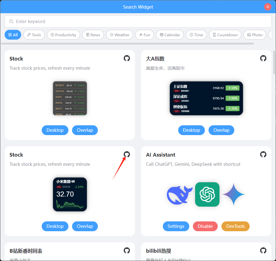
Search Categories (categories)
The categories property is set to make it easier for users to find widgets. For instance, if a user wants to find news widgets, they can select the News category in the search interface to quickly filter out related widgets.
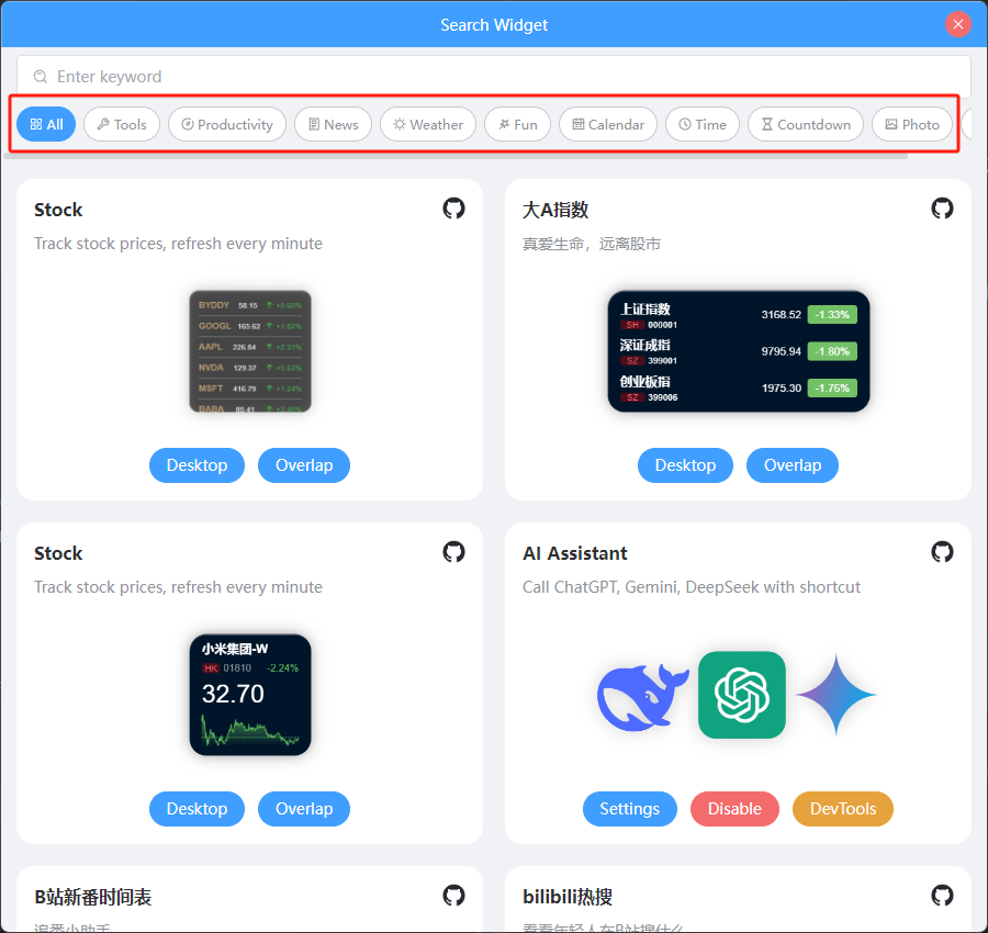
Set the widget's search categories via categories:
const ClockWidget = new Widget({
  ...
  categories: ['time'],                         // 👈 Set widget search category
  ...
})
Social Links (socialLinks)
Social links are provided to help users view the widget's source code, usage tutorials, or blogs. Set social link information via socialLinks:
const ClockWidget = new Widget({
  ...
  socialLinks: [
    { name: 'github', link: 'https://github.com/rtugeek/stocks-desktop' },
  ],
  ...
})
Currently, the configurable name values are:
- github
- gitee
- bilibili
- discord
- tiktok
- douyin
- youtube
Once set, users can see the widget's social link icons in the search interface and click them to open the corresponding links.