Widget Theme
Built-in CSS Variables
If you want to modify the theme of a widget, you can achieve this by modifying CSS variables. Here are the built-in CSS variables:
:root{
  --widget-color: #fff;                                         /* Widget text color */
  --widget-primary-color: rgb(0, 149, 255);                     /* Widget primary color */
  --widget-divider-color: rgba(255,255,255,0.4);                /* Widget divider color */
  --widget-border-radius: 22px;                                 /* Widget border radius */
  --widget-border-color: rgba(255,255,255,0.4);                 /* Widget border color */
  --widget-background-color: rgba(0,0,0,0.5);                   /* Widget background color */
  --widget-background-border-color: hsla(0,0%,100%,.06);        /* Widget background border color */
  --widget-background-box-shadow-color: hsla(0, 0%, 100%, 0.1); /* Widget background box shadow color */
  --widget-font-size: '14px';                                   /* Widget font size */
  --widget-font-family: 'inherit';                              /* Widget font family */
  --widget-padding: 12px;                                       /* Widget padding */
  /* Variables below are not recommended to be modified */
  --widget-outer-padding: 12px;                                         /* Widget outer padding */
  --widget-outer-shadow-color: rgba(0, 0, 0, 0.2);                      /* Widget outer shadow color */
  --widget-inner-width: calc(100vw - var(--widget-outer-padding) * 2);  /* Widget inner width */
  --widget-inner-height: calc(100vh - var(--widget-outer-padding) * 2); /* Widget inner height */
}
Widget Size
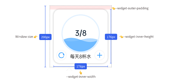
The actual display size of a widget is not equal to the window size. Usually, a 12px margin (--widget-outer-padding) is reserved for displaying shadows, so the actual size of the widget is:
--widget-inner-width = 100vw - var(--widget-outer-padding) * 2--widget-inner-height = 100vh - var(--widget-outer-padding) * 2
In the legend, if the window size is 200px, the actual size of the widget would be 200px - 12px * 2 = 176px.
Widget Background
Normally, use <widget-wrapper></widget-wrapper> to wrap the widget content, which automatically applies the widget's background color, background border, background border radius, background shadow, and other styles.
<template>
  <widget-wrapper> //👈 Automatically applies widget background styles for you
    <div>Widget Content</div>
  </widget-wrapper>
</template>